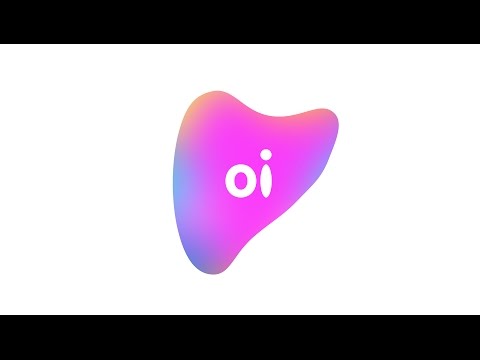
British-American branding firm Wolff Olins has created a shapeshifting logo for South African telecoms company Oi that changes colour and form in response to people's voices.
Volume increases the size of the logo, whereas changing pitches vary the colours and shape. Quiet, low voices create "calm" blue versions, whereas louder more high-...
Si te gusto esta noticia puede que te interesen estas..